A mobile-friendly website is essential for your home service business as over 60% of customers search on mobile devices, especially during emergencies. Google prioritizes mobile-optimized sites in local search results, improving your visibility for “near me” queries. You’ll capture more leads with faster load times, click-to-call features, and simplified forms that increase conversion rates by 70%. Each second of delay reduces conversions by 7%. Discover how these optimizations directly impact your bottom line and customer acquisition costs.
Key Takeaways
- Mobile-friendly websites capture 60% of home service searches, especially during emergencies when immediate help is needed.
- Google prioritizes mobile-optimized sites in local search results, boosting visibility for “near me” queries through improved user experience.
- Mobile users convert 70% better with simplified forms and click-to-call functionality for immediate contact, especially when they come from mobile devices.
- Responsive design, fast loading speeds, and streamlined navigation prevent high bounce rates from frustrated users.
- Each second of page load delay reduces conversions by 7%, directly impacting ROI and customer acquisition.
Mobile Search Trends in the Home Service Industry
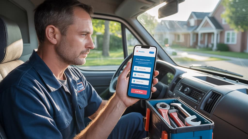
While desktop searches once dominated the online landscape, mobile devices now account for over 60% of all searches related to home services. This shift means your potential customers are increasingly searching for plumbers, electricians, and contractors while on the go, using smartphones rather than computers.
Studies show that homeowners facing emergencies—like burst pipes or electrical failures—typically conduct immediate mobile searches for quick solutions. Having a mobile-friendly website is essential for capturing this urgent mobile traffic. Customers who encounter difficult-to-navigate sites will quickly bounce to your competitors.
To stay competitive, you must optimize your website for mobile by implementing responsive design, ensuring fast load times, and simplifying navigation.
How Mobile Optimization Affects Your Local SEO Rankings

Google’s algorithms now prioritize mobile-friendly websites in local search results, making mobile optimization a key factor in your visibility to nearby customers. When your site performs well on smartphones, you’ll rank higher in local searches, appearing more often in the vital “near me” queries that drive business.
Mobile optimization directly impacts significant SEO metrics like bounce rates and dwell time. A fast-loading, easy-to-navigate mobile site keeps potential customers engaged longer, signaling to Google that your content is valuable and improving web traffic. This positive mobile-friendliness enhances customer engagement. user experience translates into improved local SEO rankings.
Remember that your competitors are optimizing their sites too. Without a mobile-friendly website, you’re fundamentally handing local customers to other businesses that make search engine optimization a priority. mobile access A mobile-friendly site is essential for attracting customers.
Converting Mobile Users Into Paying Customers
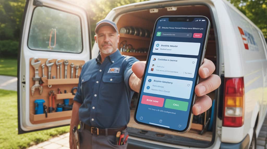
Studies show that mobile users have 70% higher conversion rates when forms are simplified—limit fields to essential information only.
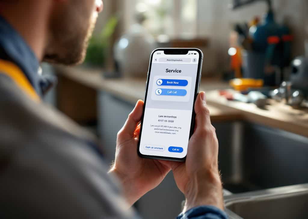
Implement click-to-call functionality so prospects can contact you with one tap rather than copying and typing your number.
Page load speed remains critical; every second delay reduces conversions by 7%.
Use customer testimonials strategically near conversion points to build trust.
Finally, create mobile-specific offers with urgency elements like “Same-Day Service Available” to motivate immediate action.
Remember that mobile users often have immediate needs—make it effortless for them to choose your services.
Key Elements of a Mobile-Friendly Service Website
When designing a website for your home service business, several critical elements must work together to create an effective mobile experience. Your mobile-friendly website should prioritize simplicity and functionality, allowing potential customers to quickly find what they need without frustration.
- Responsive web design that automatically adjusts to different screen sizes, ensuring your content looks great on smartphones, tablets, and desktops.
- Fast loading speeds optimized for mobile users who may have limited data or slower connections while searching for emergency services.
- Streamlined navigation with prominent contact buttons, clear service menus, and minimal scrolling to access key information.
Measuring the ROI of Your Mobile Website Investment

Beyond design elements, you’ll want to know if your mobile website is actually paying off for your business. The importance of a mobile-friendly website becomes evident when you track specific metrics that demonstrate real returns.
Start by monitoring your conversion rates before and after launching a site optimized for mobile devices. Calculate the value of each new customer acquisition through your mobile platform compared to your investment costs.
Track increases in:
- Call volume directly from mobile searches
- Form submissions from smartphones
- Appointment bookings via mobile
- Decreased bounce rates
- Improved search rankings
Use Google Analytics to measure these improvements, setting up goal tracking for key actions.
The data will reveal whether your investment is generating the expected returns and identify areas where further optimization could increase profitability.
Frequently Asked Questions (FAQs)
Q: Why is having a mobile-friendly website so important for home service professionals?
A: It’s crucial because a mobile-friendly website ensures that potential customers can easily navigate your site on their mobile devices. With more people using mobile devices to search for services, a website that isn’t mobile-friendly can lead to lost business and poor user experience.
Q: What does it mean to optimize your website for mobile?
A: Optimizing your website for mobile means adjusting your site’s design and functionality so that it looks good and works well on mobile devices. This includes using responsive web design that adapts to different screen sizes and ensuring fast loading times to keep mobile visitors engaged.
Q: How does mobile-first indexing affect my website ranking?
A: Google’s mobile-first indexing means that Google primarily uses the mobile version of your website for indexing and ranking. If your website isn’t mobile-friendly, it could negatively impact your search engine ranking, making it harder for potential customers to find you online.
Q: What are some benefits of a mobile-friendly website?
A: Benefits of a mobile-friendly website include improved user experience, higher conversion rates, and better search engine rankings. By making your website mobile-friendly, you enhance the overall experience for mobile visitors, which can lead to more inquiries and bookings.
Q: How can I test if my website is mobile-friendly?
A: You can use Google’s mobile-friendly test tool to check if your website is mobile-friendly. Just enter your URL, and it will analyze your site for mobile usability and give you suggestions on what to fix!
Q: What should I do if my website isn’t mobile-friendly?
A: If your website isn’t mobile-friendly, it’s time to make some changes! Consider using responsive design to create a mobile-friendly experience, or hire a web designer who can help you create a mobile-friendly website that meets modern standards.
Q: How does responsive web design work?
A: Responsive web design allows your website to automatically adjust its layout and content based on the screen size of the device being used. This means that whether someone accesses your site on a smartphone or a desktop, they’ll have a great user experience.
Q: Why does Google prioritize mobile-friendly websites?
A: Google prioritizes mobile-friendly websites because they want to deliver the best possible user experience to their searchers. Since a significant portion of searches come from mobile devices, sites that are optimized for mobile are favored in search rankings.
Q: Can a mobile-friendly website increase my conversion rates?
A: Yes, absolutely! A mobile-friendly website creates a smoother user experience for mobile visitors, which can lead to higher conversion rates. When users can easily find what they need on their mobile devices, they’re more likely to book your services!
Q: What steps can I take to make my website mobile-friendly?
A: To make your website mobile-friendly, you can start by implementing responsive design, optimizing images for faster loading, simplifying navigation, and ensuring that all important information is easily accessible on mobile devices. These steps will help you create a mobile-friendly website that attracts more mobile visitors.
Conclusion
Don’t let your online presence become a business limitation. Your mobile-friendly website isn’t just a digital nicety—it’s your 24/7 salesperson reaching customers when they need you most. By optimizing for mobile now, you’ll boost your visibility, capture more leads, and stay ahead of competitors who haven’t adapted. Make the investment today in a mobile-friendly site, and you’ll watch your customer base grow. conversion rates—and revenue—grow tomorrow.


